February’s art for the Art Bead Scene challenge was this 1925 Vogue cover. The artist, Sonia Delaunay, came to Paris at the turn of the 1900s to join the avant-garde movement. She and her husband pioneered an abstract form of art called “simultaneism” which was characterized by dynamic contrasting colors and shapes.

You can certainly see the dramatic effect of shape and color in this piece. Her art frequently celebrated the excitement of urban life. The 1920s was a time of dramatic change for America as the promise of a new century gleamed in every automobile, every electric light, every new fashion, and every new style of art. This magazine cover feels of adventure, exploration, of an afternoon picnic and driving tour.
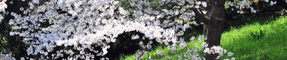
In creating jewelry inspired by this artwork, I did initially experiment with the patterns and graphic elements, but it didn’t feel like me. I don’t wear bold geometric designs, especially with harsh metallic angles like this piece accentuates. And I wasn’t all that fond of the bright contrasting hues of red-orange and navy. So I had to think about what I had in common with the scene. Obviously we’re to feel excited by the prospect of travel and the independence that having a personal automobile would provide. I’m always up for a drive (after taking Dramamine of course) and when I have an afternoon for leisure, I head to the forest. And voila, the necklace was born.

The bright orange was subdued somewhat and paired with warm copper to feel like autumn woods on a bright afternoon. I decided to add a touch of the orange color with a technique I had been wanting to try. My favorite jewelry artist, Heather Powers, came out with a new book of metal and polymer clay techniques for jewelry. I received it as a Christmas present and had been eager to try out her tutorial for clay berry headpins. I made up several for this project – you mix clay to the desired color and press it into shape around the end of wire. Before baking you sprinkle the clay with embossing powder. As the clay sets up the powder melts and leaves a subtle shine of gold (or whatever color you use) on the top. I really enjoyed making these and hope to use more soon. I layered these berries against a hand-cut and textured copper leaf. To bring a bit of contrast, and echo to the more industrial elements in the art, I used dark gunmetal-finish wire to make a wire wreath with little tendrils – I love making these. Some Czech glass beads, bead caps, and a polymer clay of teal and orange made by Heather give a bit more color and finish up the design.

And the earrings are basically all the main elements of the necklace in smaller scale. I used only 1 berry headpin on these and cut the wire long so I could curl the edge up into more tendrils.
In the end, I’m most pleased with the set. It doesn’t look directly inspired by the magazine cover, but I was able to pull a few elements that I liked from the art to make something that I love. The jewelry speaks to me of happy things – warm sunlight on berries, leaves turning golden and brown, whispers of autumn, twigs, and days filled with the beauty of nature. Anyone else ready for a drive into the woods?
Blessings to you,
Sarah

A lovely set and great interpretation, Sarah. You’re so talented! 🙂
Thanks Eliza! The monthly challenges have really been growing me as an artist.
Absolutely beautiful!